

Inland Press Association rebrands with Creative Circle
Starting a new conversation with rebranding, at Inland Press Association
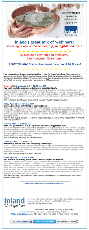
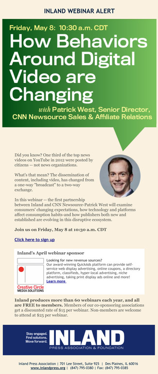
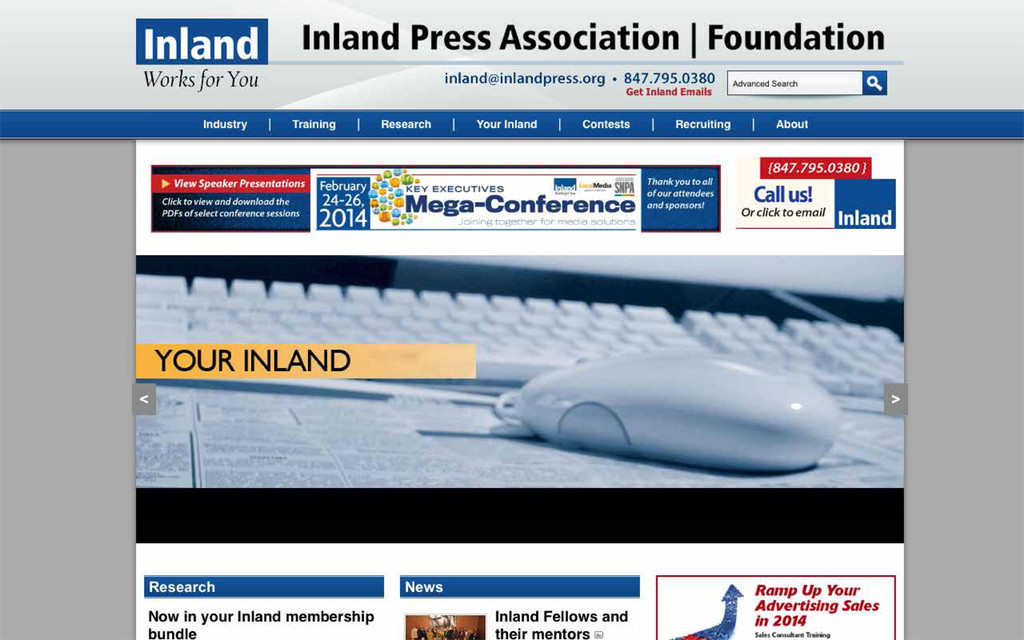


A bold, fresh brand that starts the conversation – that’s the new message that Inland Press Association has been signaling to its more than 1,100 members since Creative Circle Media Solutions rebranded the industry organization in spring 2014.
“We have more pride when we put our stuff out there,” said Patty Slusher, Inland’s director of membership and programming, about what’s changed.
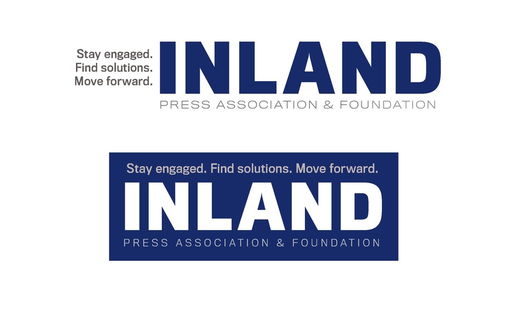
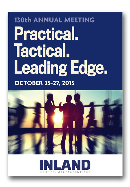
The new look imparts a new mission that’s built on the wisdom of Inland’s 130 years, with the message: Stay engaged. Find solutions. Move forward. The rebranding process took about six months and 200 prototypes, said Creative Circle Media Solutions founder and CEO Bill Ostendorf.
The logo and tagline signal that Inland is a resource for the dynamic changes in the industry, looking ahead, said executive director Tom Slaughter. “We believed it would be important to change the way we talked about Inland, but also change the visible way people related to Inland.”
 "That meant talking people through to those a-ha moments," said Ostendorf. The process started with compiling a list of the many offerings Inland has, in programming and training. More than other newspaper industry organizations, Inland impacts every department at a newspaper. “Even they were amazed when we assembled this list of everything they do,” he said.
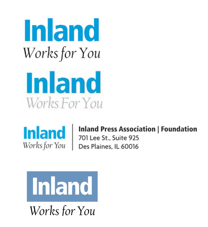
Through about 18 to 20 rounds of prototyping, taking place from fall 2013 and into spring 2014, Ostendorf and CCMS lead designer Lynn Rognsvoog started with a broad brush. The existing logo and taglines had drifted into inconsistency through the years, with several different taglines being used. “There was a lot of visual and conceptual chaos around the logo,” Rognsvoog said.
During the discussions about rebranding, the guiding question was, “Does everything we print reflect who we are and who we’re trying to be?” Slusher said.
The drastic changes in the industry heightened the sense of “how outdated you could be,” she added.
It may seem counterintuitive to start so broadly, with many versions showing different fonts, colors, configurations and taglines, Rognsvoog acknowledged, but the process is really more about the conversations that need to be had. “Providing broad categories of options in the beginning really helps people discover who they are even if they have never thought about it that way before,” she said.
“Inland is a very special group. They work hard to help a wide range of staffers at their member papers, putting on a wide range of programs for editors, sales reps, circulation managers, HR supervisors, publishers, owners, photographers and digital managers,” said Ostendorf. “Everyone in Inland is very personal and very helpful. We wanted to get that across but also strengthen their brand, which was aided by switching to a darker blue and bolder type.”
Inland was founded in 1885 by six newspaper publishers in the Midwest, but it’s a national organization with members in all 50 states, Slaughter said. That meant taking into account whether it was time to change the name. Should we drop “Inland” or add “national” or make some other change to signify the growth of the association?
“They decided the name was too valuable to walk away from,” Ostendorf said, but the discussions were productive in helping them get clearer on what they did want, which was a stronger and bolder presence as an industry resource.
It was also important to have a strong brand because Inland co-sponsors lots of programs with other groups and its old branding looked week when displayed next to the brands of newspapers, vendors and other press associations where it was often displayed.
In the end, “it was simple, it was clear, and it was bold,” Slusher said. “(It’s) something that stands on its own, and can impart our own innovation and creativity. It can move years forward and still hold true.”
The resulting change was not dramatic, although they considered dramatic changes. “And that’s okay,” says Ostendorf. “It’s a good process to explore a lot of options, even if it brings you back to a familiar place.”
The best part of the changes was bringing a consistency to the Inland brand and everything they do.
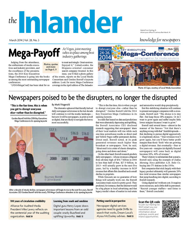
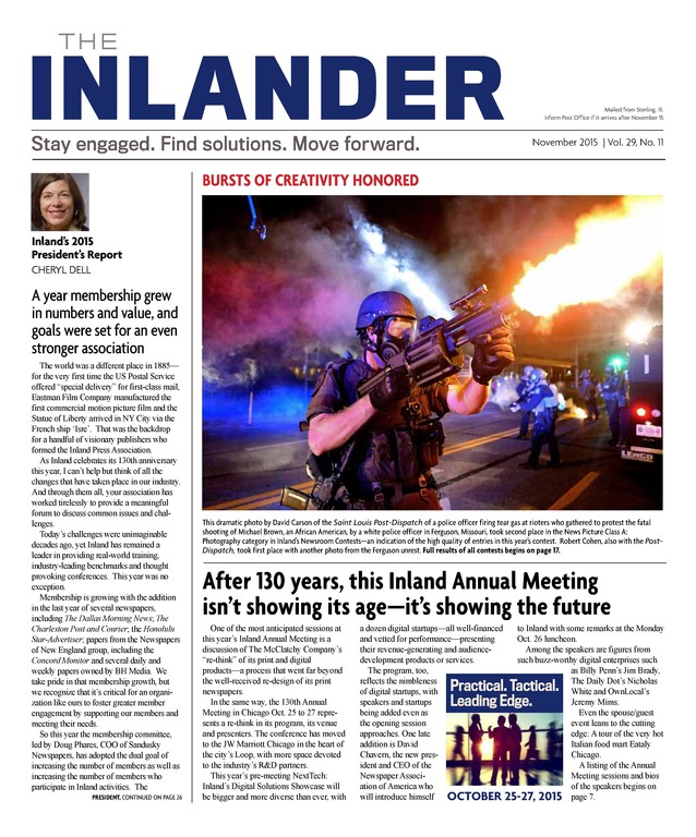
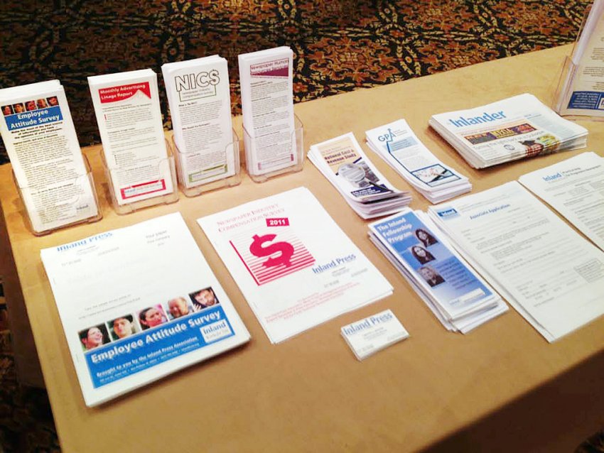
The branding change led to tweaks to the design of The Inlander, the association’s monthly publication, all of their signage, brochures, web site, e-blasts and even forms. “It’s an ongoing process and we’re still finding things to bring into the same type families and style,” says Ostendorf. “But it’s important for associations like Inland, which are leaders in teaching others about branding and design and strategy, along with newspapers who do the same things for their advertisers, to make sure they have their own house in order.”
--------------------------------------------------------
AVAILABLE FOR DEMONSTRATIONS
Bill Ostendorf is available for demonstrations about how rebranding your organization can poise you for growth and innovation. To schedule a demo, contact him at bill@creativecirclemedia.com or 401-455-1555.