A newspaper for Bermudians is reborn
We were very excited to have an opportunity to help the Bermuda Sun.
The island was a wonderful place to have to travel to but this paper's mission and passion fed the kind of journalistic fire we all aspired to when we got into this business.
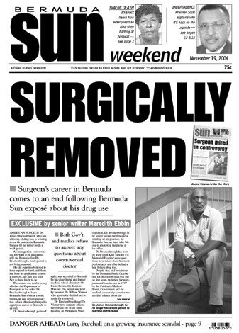
Like many family newspaper owners we deal with, Randy French, the paper’s publisher and owner, was passionate about his paper and its role in shaping Bermuda’s future. As one of two national papers on the island, the Sun was uniquely positioned to play a leading role.
He told us we needed to shake things up; that Bermuda needed a paper willing to be tough and cut through the complacency common on the well-off island nation. But we also needed to have fun and entertain. And he wanted his paper to focus on the Bermudian population and be an advocate for everyday people.
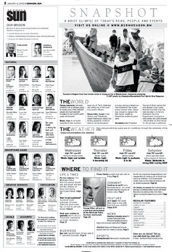
We worked with the staff to refocus on Bermudians and their lives and needs. Their new slogan, “Beyond the headlines,” reflected a desire to stop covering government and news the old- fashioned way. We stressed writing better headlines and doing better breakouts. We worked to restructure the staff and the newspaper, reducing wire content and advertorial pages and putting a stronger emphasis on Bermudian news.
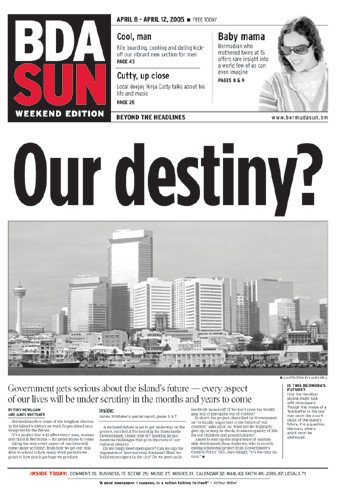
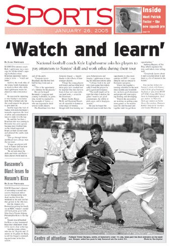
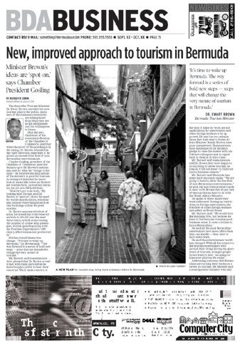
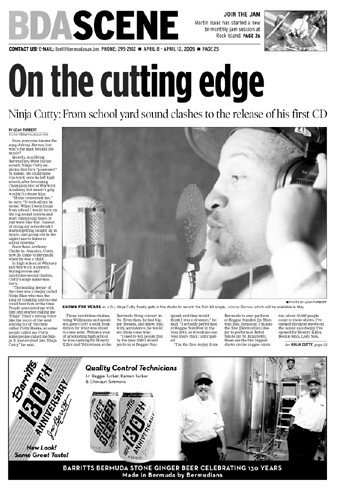
During the design process, we showed the staff dozens and dozens of ideas for a nameplate and they picked one of the more radical concepts – change the name of the paper to the shorthand many Bermudians use for the island, BDA.
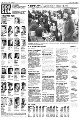
The BDA SUN was designed as a square “patch” with a flexible “rail” that can run vertically or horizontally, giving editors the ability to make the paper look quite different from day to day. Then we went on to design page flags, select headlines, test body type and design templates and a complete stylebook.
Nimrod text type is dramatically bigger looking than their old font (Times). It is also more efficient and saves space. Gotham Condensed was selected as the primary headline font to give editors better counts on headlines than the Interstate they had used before. We recycled Interstate, using it in the nameplate and page flags, and introduced Poynter Display to give the paper some serif display type for contrast.
And, on Friday, April 8, 2005, the new Bermuda Sun was born.
The first issue was free and Bermuda Sun staffers – along with Creative Circle’s lead designer on the project, Jennifer Boucher Albers – stood on street corners and at ferry docks passing out the paper. Extra advertising sold for the premiere edition made the paper huge, but production went pretty smoothly on launch night. And, of course, the response was overwhelmingly positive.
We've been back to Bermuda many times for follow up projects, including helping them switch from Quark to InDesign for editorial production and redesigning several other products owned by the company. We launched several web sites for the company as well.
