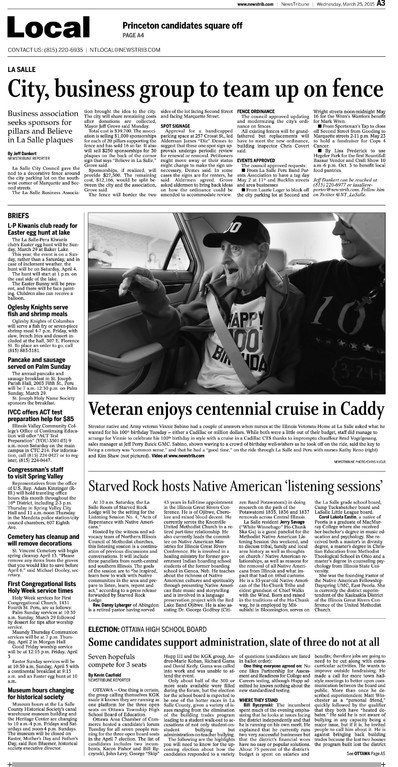
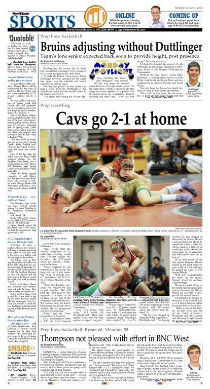
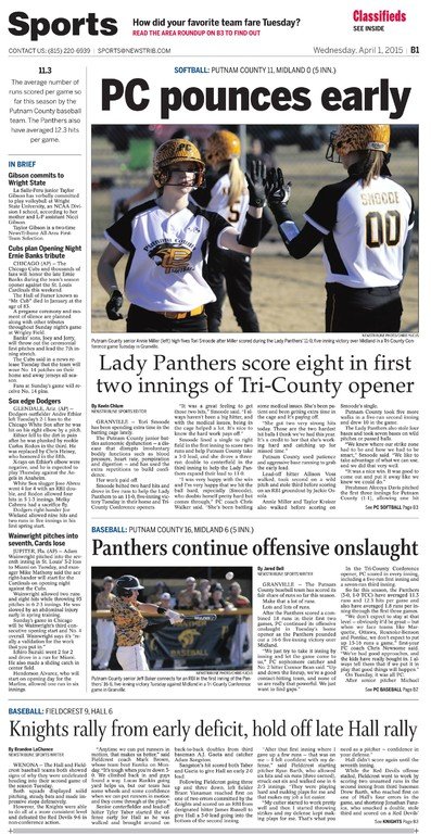
Circulation gain turns the tide after NewsTribune redesign
New look from Creative Circle Media Solutions signals a new day, gives focus and energy to daily paper in La Salle, Ill.
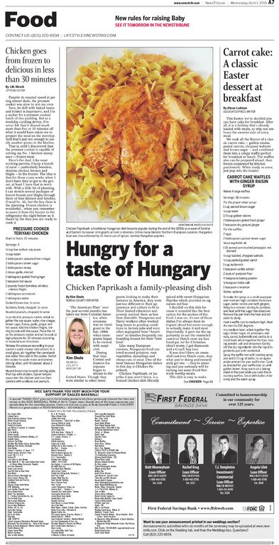
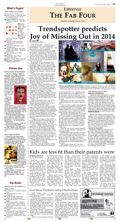
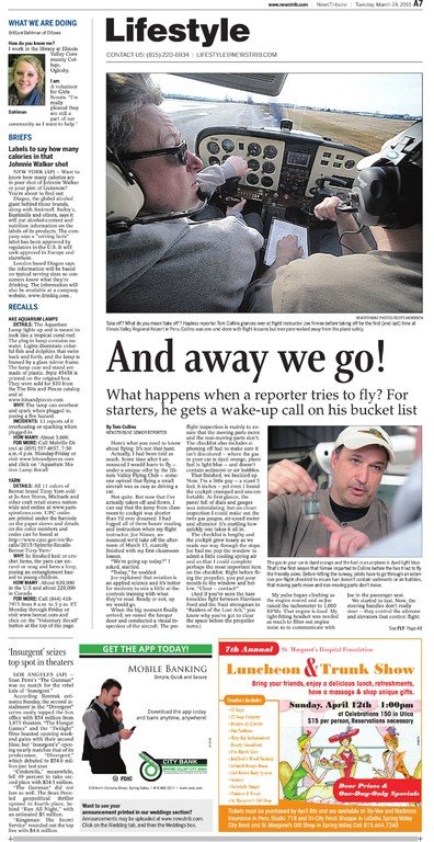
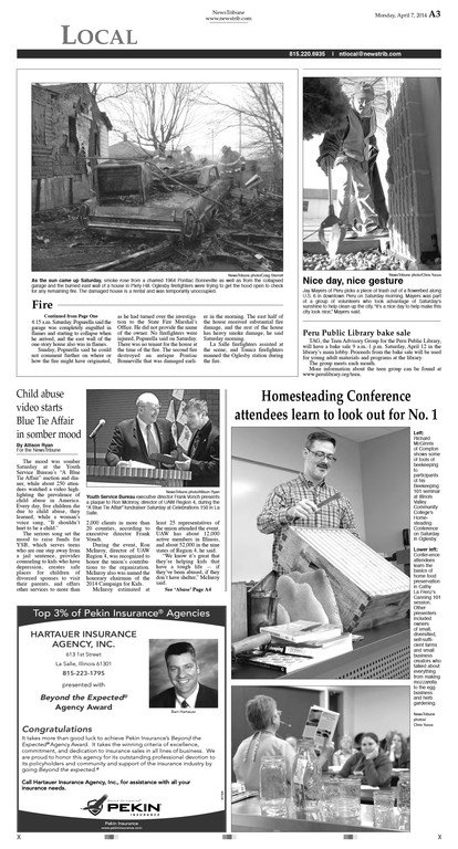
PROVIDENCE, R.I. – It’s a new day at the NewsTribune in La Salle, Illinois, where print circulation is up, and the leadership and staff are celebrating a turning of the tide.
“We were happy,” said Joyce McCollough, president and publisher of Daily News Tribune Inc. in September 2015 after the August circulation report came in. “We were really excited.”
McCullough credited the one-two punch of a Creative Circle Media Solutions redesign launched in late 2014 and a circulation campaign that took advantage of the cleaner, more approachable design to signal a new era.
“We had a new product for people to see,” she said, which was easier to navigate, more connected and more informative. “What we needed was a focus and an energy.”
Before the redesign, it was a hard sell to convince readers and advertisers that the NewsTribune was keeping up with the times. After, it was clear the paper had changed its focus, “bringing all of our positives to the forefront,” said McCullough, whose company, Miller Media Group, also owns weekly agricultural publications, Illinois AgriNews and and Indiana AgriNews plus three local radio stations.
Changing the habit
When readers have been used to same-old, same-old for a long time, it takes a while for that to translate to action and establish a new habit, she observed.
But after the redesign, circulation manager Mike Miller actively started going through the old subscriber base to appeal to people who had left the NewsTribune in the past few years.
The redesigned paper gave him the firepower to have a new conversation. “How do we get people to try us again?” was the question, McCullough said. “Because we have been kind of dull.”
The same held true for the advertising staff. The redesign gave ways for the advertising representatives to open a more fruitful discussion with new or one-time customers. “Bill is well worth the money,” she said, referring to Creative Circle Media Solutions president and CEO Bill Ostendorf.
From the newsroom
The view from the newsroom is that the end result is more inviting to readers, said managing editor Linda Kleczewski. “For a print product, we’re having more of a conversation with our readers.”
Newsroom staff members were wanting fresher concepts, different ways of storytelling and more variety in presentations, “rather than a cookie-cutter presentation every day,” she said.
The process post-redesign includes more collaboration, more curiosity and more innovation, she added. “We don’t settle for just one headline.”
After the first training with Ostendorf, Kleczewski saw an “almost instantaneous change” in the way people wrote leads and headlines. “Readers have really noticed.”
McCullough agreed. Not only is the presentation more engaging, the stories are, too. “We’re asking deeper questions, fun questions,” she said of the newsgathering process.
The nuts, the bolts, the photos
Many Creative Circle redesigns start with photo training, and the NewsTribune was no exception. The process began as a collaboration that got everyone in the newsroom thinking about what photos should look like and how stories could be packaged better.
Once a new standard was established, the Creative Circle team led discussions about the NewsTribune staff’s work, and staffers started posing the questions, such as “Why is that sign in the background in the picture?” or “Why don’t we have a close-up of that person?”
“Even though it was painful, we could see things that shouldn’t be there,” McCullough said.
The result was a very practical-minded process that ultimately boosted the staff knowledge of what was missing and what could be.
In addition to photos, the display typography needed to improve, said Creative Circle lead designer Lynn Rognsvoog.
A specific issue to address was the design of the teasers across the top of the front page, which were overly formatted, Rognsvoog said. They were the same no matter the content of the tease – the headlines or the photos. Many of the photos didn’t work with the prescribed shape and size. “The typography was hard to read at any distance, so the top boxes weren’t selling papers at all,” she said. It’s a problem the Creative Circle team sees at almost all newspapers. Editors are picking the wrong stories for newsstand sales, then plugging them into a format that often doesn’t work.
The Creative Circle team worked with the staff to make the language sharper in the teaser headlines. “We encouraged them to choose the stories more carefully to actually target occasional or newsstand readers,” Rognsvoog said, and they didn’t wait for the launch to begin. That change rolled out right away.
Brand new signals
The NewsTribune’s new brand colors rely on a blue and red, with a golden neutral that can be used on infoboxes. The redesign introduced a branding color palette that reduced the chaos of too many colors. For example, “people not familiar with using color will use green in a money story,” Rognsvoog said. “We didn’t think that served them well.”
The training included codifying colors and offering up other tools so that designers could convey that a story was about money without having to resort to green. Story labels were one of those devices.
Unlearning, and having more fun
The result was more than a superficial redesign, just making the paper look better with newer fonts, McCullough said.
Headlines got better, geared to engage the reader with a more casual style. One example was a story about a community member who was discovering ancestors on a genealogical search, with the headline, “My cousin Vinny.”
“We wouldn’t have done that play on words three years ago,” McCullough said.
Staff members quickly embraced the new style of writing, she reports. “One of our reporters told me he was so excited,” McCullough said. “He had always wanted to write this way.”
That’s why McCullough said she valued the training sessions, which because of the small staff size, allowed for one-on-one sessions alongside department-wide and newsroom-wide sessions. “This was somewhat unlearning,” she said.
In fact, when advertising staff members got wind of the training successes, McCullough set up training for them, too.
Clear, important signals
A redesign like the NewsTribune’s is not just about making pretty pages, said Rognsvoog, “though I love it when pages are attractive.”
“This wasn’t a dramatic change from a design standpoint,” said Ostendorf. “The new typography, colors and branding were better and more consistent and flexible but the real change was in content and thinking. And when you compare before and after papers, the difference in approach is obvious. That’s what a good redesign is all about. And the team in LaSalle did a great job making a good paper a better one for its readers.”
The redesign signaled a whole new business and editorial approach. “This is a signal to the reader that this is different from what we used to do,” Rognsvoog added. “We’re not only making it nicer to look at, we’re making the content better. We’re telling you clearly how this paper is important to your life.”


