PBN redesign more tuned in to readers, advertisers in digital age
‘Exciting’ Creative Circle design builds business weekly’s engagement as a ‘fulcrum of the community,’ with magazine-style format, in-depth stories
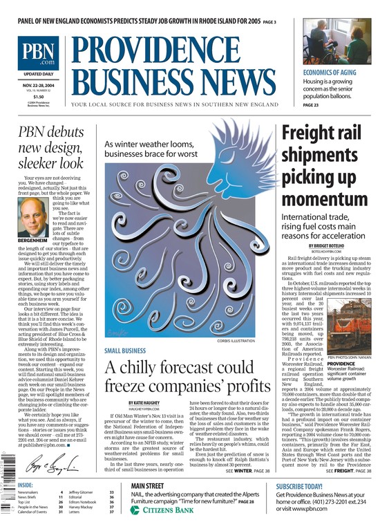

The Providence Business News needed not just a new look, but a new model that matched content to a news cycle that’s been disrupted by digital.
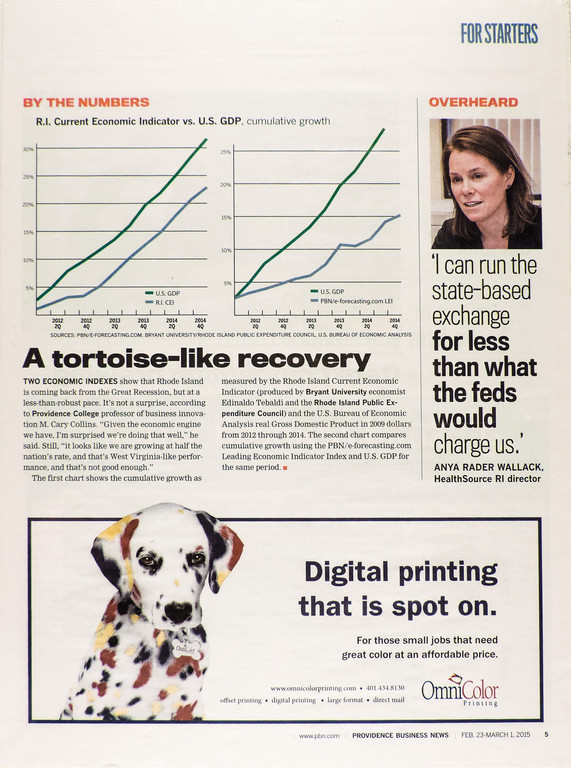
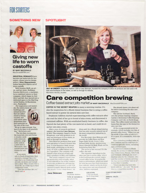
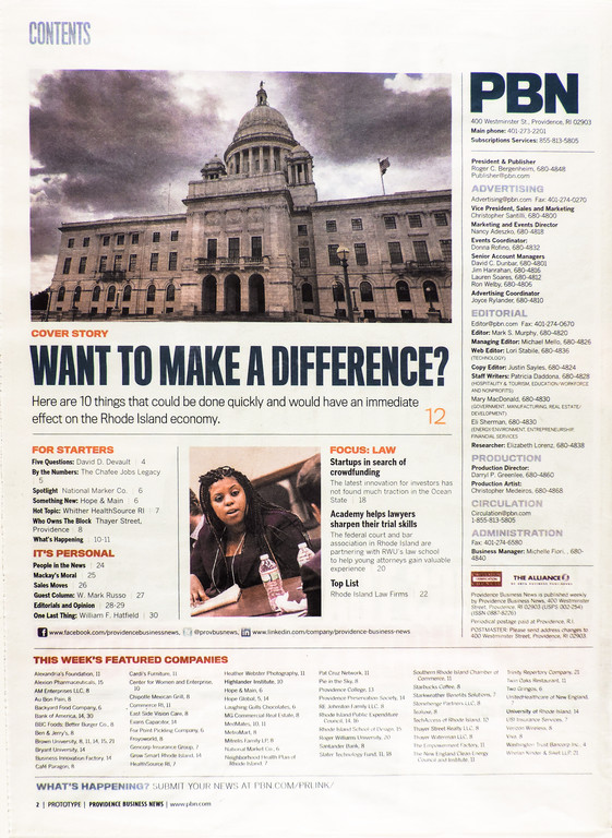
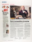
That meant bringing in Creative Circle Media Solutions to redesign the print product so that it reflected that the weekly business journal was really two products – a breaking news PBN website and a weekly newspaper that now is more like a magazine, with more attractive, inviting design and more in-depth stories.
“It’s really shifting the product so that it’s more in tune with what we’re doing,” said publisher Roger Bergenheim about the redesign, which launched in February 2015.
The result was excitement.
“I think perception is that we are doing more than what we were doing,” Bergenheim said. “I’ve been told it’s a more enjoyable read.”
A dramatic shift
When Creative Circle redesigned the Providence Business News in 2004, the format was designed for breaking news, but “since then, the world has changed dramatically,” said editor Mark S. Murphy.
PBN.com had become the access point for breaking news, so the print product needed to offer “something with a little bit of teeth,” Murphy said.
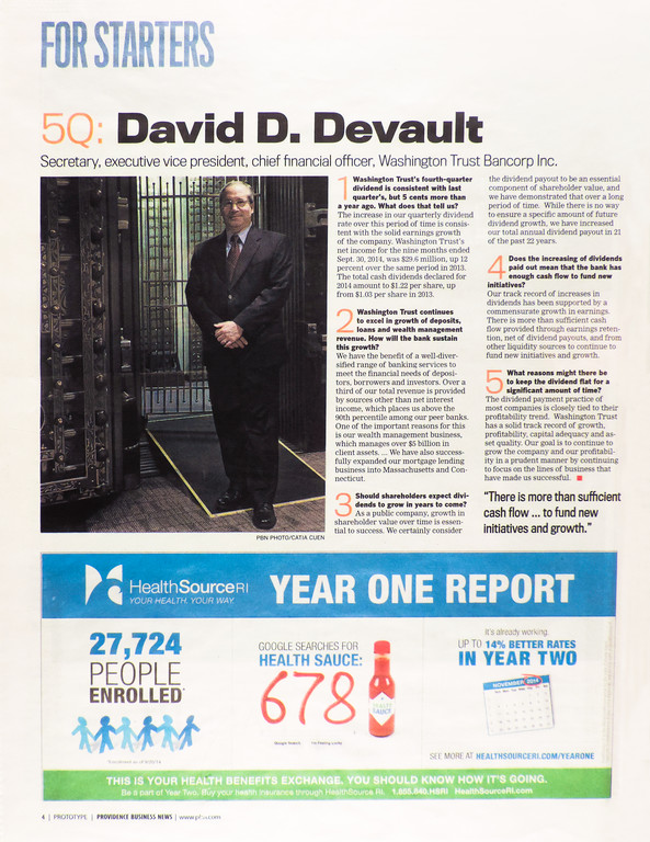
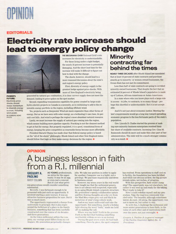
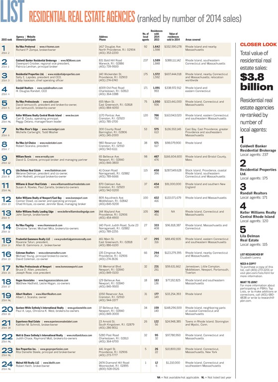
Now, with a design that features a magazine-style well in the mid-section of the paper, the paper has increased engagement, along with boosting revenue and growing an audience of younger readers.
“Our news is online,” Murphy said. “Our insight and engagement are in print.”
Reaching new readers
The paper, which has no direct competitor in the market, was seeing its circulation decline. The core readership was the so-called C-suite of business leaders, many of whom were high-income, white, male and over 50. The paper wanted to broaden into younger demographic to emerging business leaders, as well as reach more women and non-white readers.
“We’re more interested in getting the next group of leaders,” Bergenheim said, “(who) want something that looks modern.”
Covering it better
PBN wanted its design to build on the idea that “we are a fulcrum of the business community,” Murphy said. “I think it allows us to have a bigger platform to engage the business community. No one covers it like we do.”
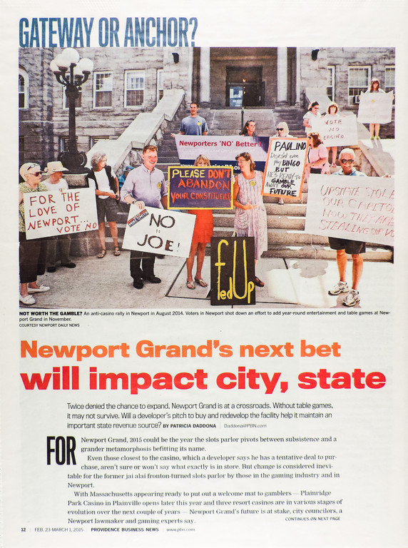
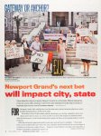
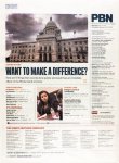
And now, readers know that. Engagement is up. The cover story now is a “real cover,” Murphy said. “It forces us to write stories that are substantial and important.”
Previously the cover would have three to five stories, but now it showcases one story with a single strong image, a strategy that has increased the engagement online as well as print. “Our cover stories now get the kind of page views we would never have gotten before,” Murphy said.
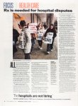
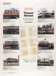
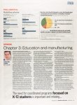
That engagement carries over to the inside magazine-style well with fewer, but more substantial features. “Our art is bigger,” Murphy said. “It’s more impactful.”
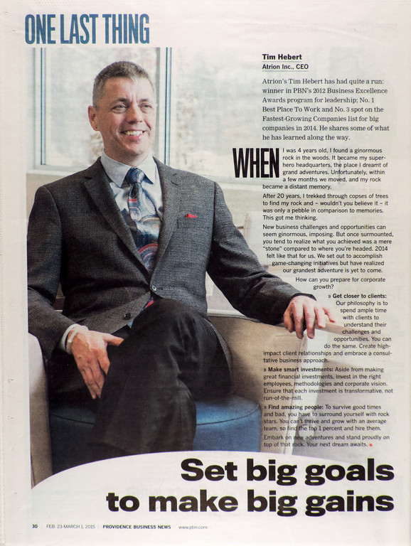
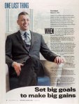
The redesign also built in new features that promote engagement with the audience PBN wants to grow, such as the One Last Thing feature, about 250 words in the back of the paper from a business leader about something he or she has learned.
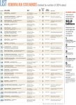
The format allows for more service journalism, such as a tax advice column. “We didn’t have enough of that,” Murphy said.
Front-and-center brand
The other major shift was in the branding. The community referred to both the web version and the print edition as PBN. “PBN has ended up being more and more front and center because it’s our brand,” Bergenheim said.
That made it logical to change the nameplate from Providence Business Weekly to PBN reversed out of blue. “I just think people like PBN,” said Bergenheim. “It’s well-respected for one thing.”
The consultant process
PBN turned to Creative Circle founder and president Bill Ostendorf again because, “Creative Circle understands newspapers,” Bergenheim said. “We got a great response when they redesigned us 10 years ago. They keep up with the behaviors of the reader.”
Bergenheim said he knew the paper wanted to bring in a consultant because of the opportunities collaboration offered – matching up their ideas with the ideas of people who “aren’t so close to it. They can question it. It’s a give and take.”
A culture change
To pull off the magazine style, the design needed a more complex set of headline treatments, said Creative Circle lead designer Lynn Rognsvoog. Sometimes story tops are blown out in a larger font with an expanded paragraph, so that meant giving attention to writing them in a way that was more engaging.
“We wanted those to be intriguing and enticing to readers so they would keep going,” Rognsvoog said. “That was a culture change.”
Murphy agreed. “This wasn’t just a redesign. It was a reimagining of the workflow. It was a reimagining of the work.”
Indeed, while Bergenheim is pleased that readers are more engaged and advertisers are happy, he adds that what he’s most proud of is how excited the newsroom and production staffs are about working on the product. “Company-wide, it’s been an excitement. It’s almost re-ignited both the editorial and advertising staff.”
