Scripps turns to Creative Circle to rebrand its Treasure Coast Newspaper group
While the papers kept their own identities, the redesign facilitated centralizing design, copy editing and visuals department
Your hometown newspaper - only better.
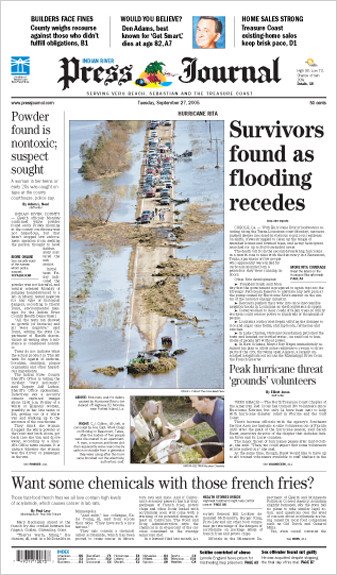
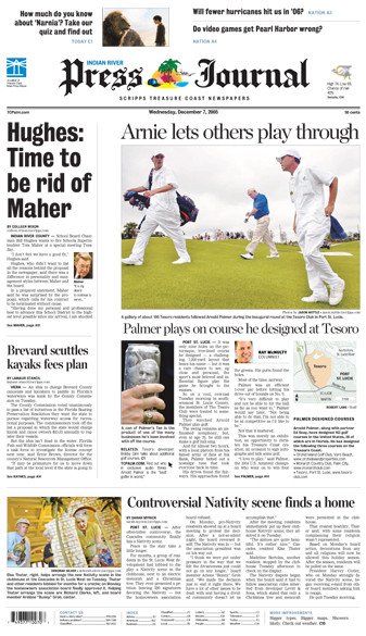
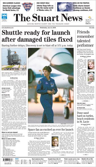
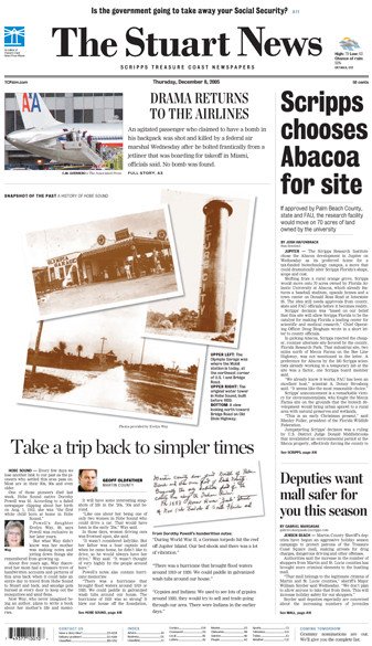
That was what top managers wanted for Scripps Treasure Coast Newspapers, a group of four dailies in a section of southeastern Florida known as the Treasure Coast.
The Stuart News, Port St. Lucie News, the Press Journal in Vero Beach, and the Fort Pierce Tribune already dominate local coverage in the fast-growing Martin, St. Lucie, and Indian River counties north of Palm Beach. But they also needed a regional flavor and better coverage of the big picture of a region experiencing explosive growth.
The project involved merging the operations of four papers, standardizing comics and editorial features, adding more color to take advantage of new presses and providing a training program to both raise the level of editing and bring common goals, standards and knowledge to the combined staff. We also helped them analyze and refocus their current and future branding for the individual papers and the group as a whole.
Realizing that life is more hectic than ever, the main goal of the redesign itself was to address the shrinking amount of time readers have to devote to the newspaper each day and give the staff the tools and knowledge to address those realities.
"We know time is precious," said Mark Tomasik, Treasure Coast executive editor. "We want a paper that has more news and information but presented in a way that takes people less time to read."
To address that, the redesigned newspapers are better organized, more lively and colorful, and most importantly, easier to scan, navigate and digest.
Section fronts will use a flexible, page-bottom box to help readers navigate the newspaper with indexing and promos to content inside and upcoming stories. Those same devices will also be used as an opportunity to engage light readers with scannable stand-alone tidbits. Meanwhile, a very flexible set of refers on page one, which can be vertical or horizontal and run above or below the nameplate, will allow editors to give page one a different look each day.
Summary headlines will be used on many section-front stories to help give more information to scanning readers.
Destination packages on page two of every section offer a mix of useful and interesting content that readers really appreciate.
Each of the four newspapers will continue to have its own distinct nameplate and zoned content, but the papers will share a consistent look unique to that area of Florida. A limited color palette will help with the visual cohesiveness. Two signature colors – Sand and Sky - will have specific functions. Sand will be the background color for layering devices, and Sky is incorporated into navigational elements.
Consistent use of these colors is designed to help light readers quickly find content that's of interest to them.
To create a more modern look, the redesign incorporates fresh typography. New styles of the popular sans Bureau Grotesque are used for lead headlines, page flags, and layering devices. Other headlines are Chronicle Display. These fonts are more efficient, allowing the staff to write more meaningful and conversational headlines. We also used a 15-column grid for editorial content, avoiding the very narrow columns caused by narrower page widths while again giving editors maximum flexibility in page design.
The four newspapers, owned by the E.W. Scripps Company, have a combined daily circulation of 107,000 and about 120,000 on Sundays.
The project was led by Bill Ostendorf, who lead the branding, training and management consulting efforts, and Kristen Powell, who spearheaded the redesign process. Several other designers and consultants provided support and alternative design concepts in the early stages of the project.
